NOV 7th 2012 (Recap): Design for Experience

In a recent event, the merits of designers being actively involved in all stages of the invention process was discussed. Topics such as the strain between designers and builders, the requirements for designing smartphones and tablets, and advice for designers of all spades was spoken on then discussed.

Silicon Valley has long been known as the crème de la crème of “making things” for as long as most of its residents can remember. The motivations range from solving one’s frustrations and impressing one’s friends to making something cool to making a bunch of cash… Nonetheless- whatever the motivation- you can’t get very far without running into an enormous need for design; Hence, the role of the designer has become a critical landmark in the Silicon Valley landscape.

For this reason, the Silicon Valley Innovation Institute gathered an experienced group of designers, each with a different area of focus, to tackle the challenge of designing for superlative user experience.

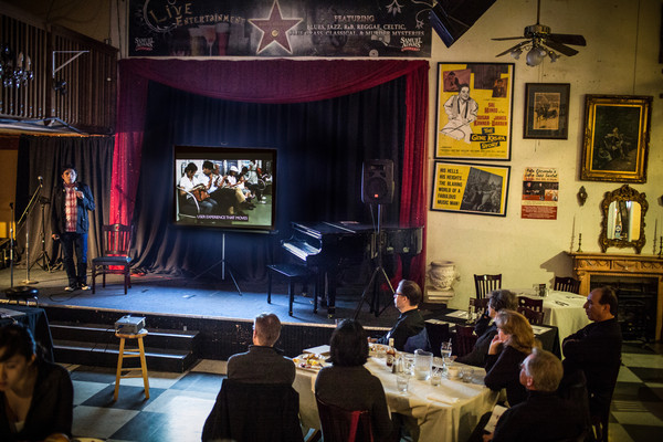
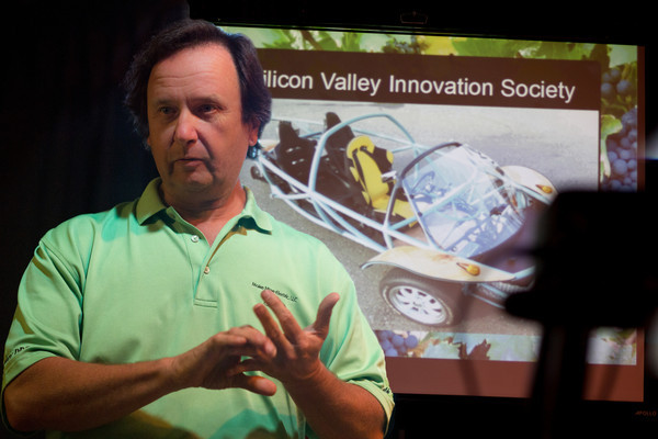
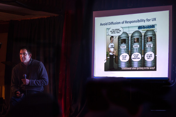
The night started off on a sound note by Jon Innes, an experienced design consultant (UX Innovation), who focused on the innate tension between designers and builders, leading to the different ways companies approach the development process:

From the specific and pre-planned waterfall method to the rapid iterations of the lean startup, Jon believes that the key is to involve designers at every stage, and to integrate the technology, the feasibility, as well as the design into the creation process.

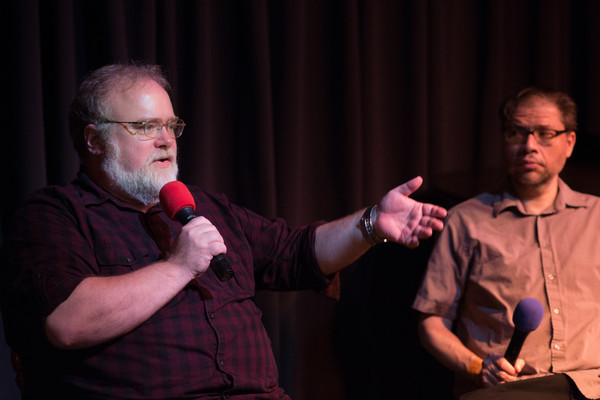
Then the torch was passed on to Rodrigo Lopez, a Peruvian-born entrepreneur (Aardvark), who gave a good overview of the unique needs behind designing for mobile phones and tablets:

An essential factor in this realm, he says, is to move fast: “Your product must move as fast as the ecosystem.” In the mobile ecosystem, the designers are designing for phones and tablets that change once or twice a year (Apple) or have a plethora of variations (Android). Plus, the competition on mobile devices rapidly changes and updates, so unless you change quickly enough to stay attractive, you will be forgotten like a week-old text message. Another important dynamic of mobile design is that, if you want your users to use a feature, it has to be easy to find and easy to use. Otherwise, it might as well not exist, because it won’t be utilized by impatient on-the-go users. In fact, it would probably be better if it didn’t exist at all, because then it wouldn’t get in the way or confuse anybody.

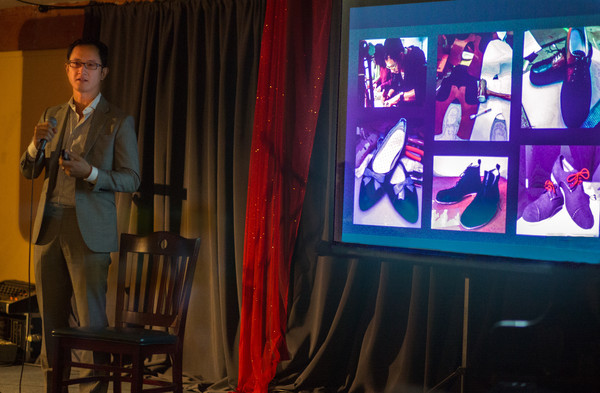
Next in line was Paolo Malabuyo, the director of product at Zinga, who introduced himself by saying, “Please notice that I am wearing a suit.”

This was a good move for a few reasons. First, it got the people to applaud. Second, it made the point that design is about all of life, not just products. Paolo has a wide reservoir of design experiences from which he shared some unique insights.

“Bask in your ignorance,” he said. If you are designing in order to make an experience good, it’s important to go through that experience yourself. We must also remember that there is only one first time for everything, so taking notes when you are going through a first experience can truly double your knowledge (not only have you learned the thing itself, but also what it’s like to learn it for the first time). Paolo also brought up the idea of a Maslow’s pyramid of design, which is a re-imagining of the Maslow’s Hierarchy of Needs with the needs of a product. From the bottom level up is functionality, reliability, usability, then beauty. In other words, if a product isn’t functional, then nobody cares if it’s usable, and whether it’s beautiful is irrelevant; Each level is a pre-requisite for the enjoyment and adoption of the next level. Another point made by Paolo is that you can help your design sense by stayingg connected with the traditional modes of creation. He himself made some custom shoes because he likes to perform a craft and do something with his hands. This kind of thing helps the inner design brain become more experienced and refined.

Our next excellent speaker was Debbie Kawamoto, lead product designer at Yammer, a social network for internal company networks:

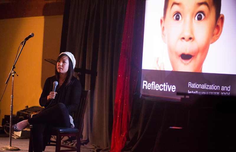
Kawamoto worked as an art director in advertising for Nissan, which gave her a unique perspective on the design process. She learned that the experience of buying something, especially something expensive, has to be more like a relationship and less like a transaction. A customer is less likely to step out of a good relationship at any stage and head in another direction (not consider buying, not buy, not recommend, or not rebuy). It’s important for a product and company to connect on different emotional level with their users. On the visceral level, it’s important for a product to be immediately appealing, on a behavioral level, it must provoke action, and on a logical level, it is still important for a product to be appealing to the mind (be a logical buy). These are all things to remember for the designer.

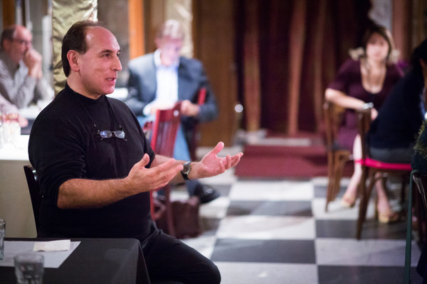
Finally, Jonathan Hirshon brought the lessons home. An experienced PR consultant, Hirshon focused on how the image of a company is designed. Touching on examples ranging from Microsoft Windows packaging to Apple’s choice to release Siri, and speculations on the Apple TV, Jonathan took us on a humorous journey examining the impacts of design on brand.

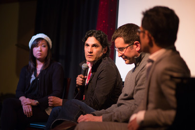
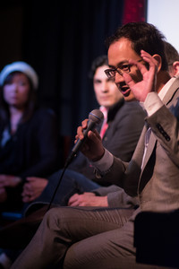
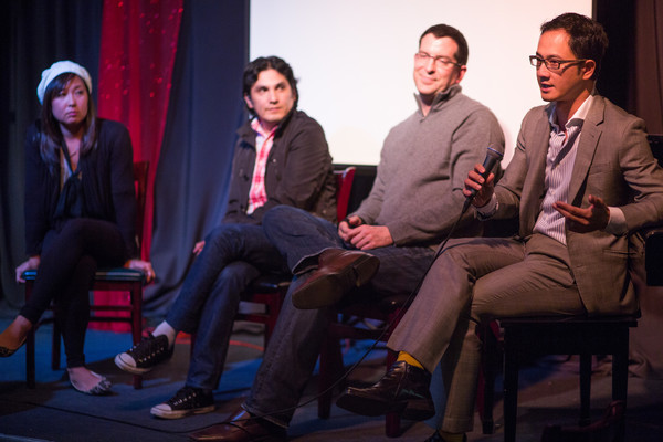
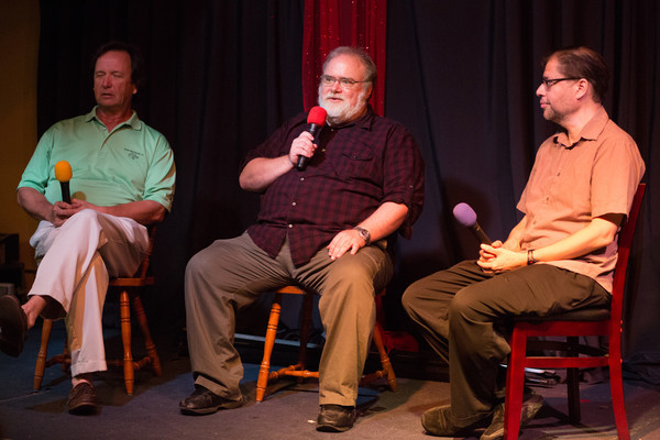
The evening concluded with a lively discussion with the illustrious panel of speakers, led by SVII founder Howard Lieberman:

All in all, everyone left thinking more about the design conundrums of life and more fully equipped to address and overcome them.

For your next SVII adventure, join us this coming Wednesday as we explore the glamorous and surprising world of Silicon Valley Tech x Fashion!

Pre-registration Tickets ($20) – On SALE NOW!
 

OCT 3rd 2012 (recap): Greased Lightning!

A car can be sexy in the same way a person can be sexy — although the trait is a bit harder to define when you’re talking about sheet metal versus flesh. Part of a sexy car’s appeal is purely physical: proportions and curves, size and muscle. Humans have eyes, lips and hips; cars have headlights, grilles and fenders. But then there’s the truly intangible — the animal attraction that turns mere mortals into drooling buffoons. For this, a machine must be bold, distinctive and aggressively elegant. And there’s the sound, too — a car’s voice. A beautiful car you admire. A sexy one you desire.” – Marc Lachapelle

At SVII this month, we parted the curtains of Angelica’s Bell Theatre with an opening act by German “comedian”, Sven Beiker, also known as the Executive Director of CARS (Center for Automotive Research at Stanford):

Sven had started his illustrious career at BMW, stationed at a variety of locations including the BMW lab here in the Silicon Valley. The CARS institute currently deals with a lot of the electronics research, mechanical engineering, and even legal aspects of cars. Among the interesting tidbits that Sven shared are innovations in the area of secondary use for car parts (such as the battery), especially relevant in light of the relatively short 13-year lifespan cars have to their manufacturers; These folks seem to also be carving a space in the legal and governmental playgrounds as well. After an energetic Q&A, we lifted our glasses to Sven, as he waved goodbye to celebrate German reunification day.

Our intermission was provided by Jessie Chen and Roland Van der Veen – a swing dance showcase with a little bit of cheek and sass to the program’s namesake musical hit “Greased Lightning”:

Missed it? You can check out the original video here:

Next up was Peter Oliver of Switch Vehicles, located in Sebastapol (just across the Golden Gate Bridge):

From a background in software and hardware, Peter had decided to combine his passion for cars and his propensity to have fun into a new project involving electric power conversion. His aspiration? To make an automobile with a 100 mile range, that can carry 3 to 4 people, and cost only $15,000. And thus, “The Switch” was born.

The Switch is a three-wheel vehicle with 33% of the weight on each tire. (The decision to use 3 wheels was inspired by the desire to be classified by the FMVSS (Federal Motor Vehicle Safety Standards) as a motorcycle.) Putting his business sense to work, Peter also realized that the hardware industry could give him an edge by allowing him to buy standard parts, and farm out more specialized components to contract manufacturers. The audience was dazzled by the Switch’s many possible configurations… and even superhero qualities, such as one version’s ability to carry 600 lbs of hay. In addition, the building of the Switch also leaves its mark as the crux of various training programs for high schools and prisons.

Finally, Brad Templeton, Google’s car consultant and board member of the Electronic Frontier Foundation painted a vision of Robocars:

At first, he cited the many reasons why cars really should be automated and electronic. For example, humans are bad drivers and 34,000 people are killed in America and 1.2 million worldwide every year as a result, many useless hours are spent driving in traffic, 25% of CO2 emissions today are from cars, and 8 cents per mile is continuously being spent on accidents and even more on gas. He also demonstrated that 60% of the land area in LA is dedicated to cars from driveways to parking lots to highways. Brad suggested that if we had small electric robocars they could be called up whenever they are needed, they can also self park 3X tighter and in areas that are mostly out of sight. For this seemingly futuristic system to be implemented, the AI systems needed are not the omniscient ones of science fiction lure, but actually rather simple collision avoidance systems that are fairly attainable. Brad also showed a convincing video of a Google robocar picking up and driving a blind man to and from the store without any human intervention. The video was created by Google-hired Stanford students who had won the DARPA challenge for off road and urban driving, the day after Gov. Jerry Brown signed into law the legal ability to have robocars on the road.

We ended the evening with a lively panel discussion moderated by Max Sims (our auto-savvy presenter from the Images Speak event):

…and discussed issues ranging from the business models around car and battery ownership, to the Minority Report scenario of being betrayed by your robocar. (And can a Jewish man have a robocar drive him to the temple on the Sabbath?)

All in all, our impressive cast of speakers presented compelling perspectives on how the Silicon Valley is innovating in the area of transportation, and in the spirit of SVII, each broke out of conventional thinking in his own unique ways.

Be sure to join us on our next adventure: Design for Experience! (Innovations in User Experience and Product Design)

Pre-registration Tickets ($20) on SALE now!

SEPT 5th 2012 (Recap): Images Speak

A picture is worth a thousand words…but try saying that with a picture. – Brazilian proverb

While the power behind the ability to communicate through images has long been revered, the different ways images are used in communication are constantly being invented, combined, redefined, and rediscovered. Last Wednesday at SVII, we got a taste of the different ways that people are refining their craft of connecting with an audience through picture-based communication.

After a riveting opening performance by San Francisco-based artist, Scot Sier:

…and delectable food and drinks from the warm hosts at the Angelica’s:

..we embarked on our adventure to explore the leverage of visual media.

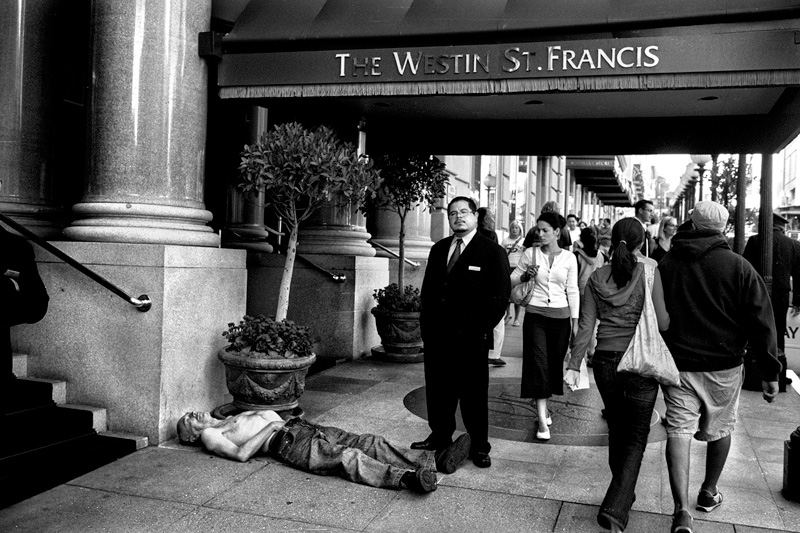
It started with Emilio Banuelos, a photographer whose passion is found in the stark truths that can be gleaned from everyday life:

He uses a rather small classic camera because he knows that it is unintrusive and puts his subjects at ease. In order to get authentic images of the way people live, he enters their environments and lives and travels with them (having spent time in Mexico and traveled across the country in a Greyhound bus). When photographing someone, it is important for Emilio that the subject also feels that they are treated with respect and knows that he values their time.  This, in the end, also leads to better pictures:

Our next presenter was Christos Chrestatos, a filmmaker and creative director from New York City:

He took us deep into the process behind the making of one of his music videos, “The Hard Way,” by Gotham Green and Quickie Mart:

Christos reminded us that we naturally move towards things that we love and that make us feel loved, and that unconditional love for your client’s project is also necessary in order to discover and draw out the potential behind a brand’s identity (which is ultimately also a reflection of the owner).  He also drove home the importance of uniqueness supported by rationality (doing things differently, but always in a way that makes sense) when generating creative concepts for a new client.  In this video, he uses broad symbolic imagery in a way that is not typical in the hip-hop music scene. His inspiration comes partially from myths and epic movies that he has been fascinated by in the past; Such experiences give him a deep well to draw ideas from for the projects that he works on now.

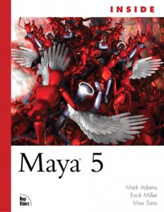
Our final speaker was Max Sims, author and expert in Maya, graphic artist, professor, designer and entrepreneur:

He does many things, but the driving force is always innovating and creating. He gave us insight into how you analyze images (and objects) based on the emotions that they elicit–and how to actively design for different emotions. (For example, sports cars tend to evoke strong emotions due to their tendency to value flair over balance in their designs; This manner of taking shapes to their extremes serves the alternative purpose of sports cars which is to double as fashion pieces.) To learn some more from Max, check out:

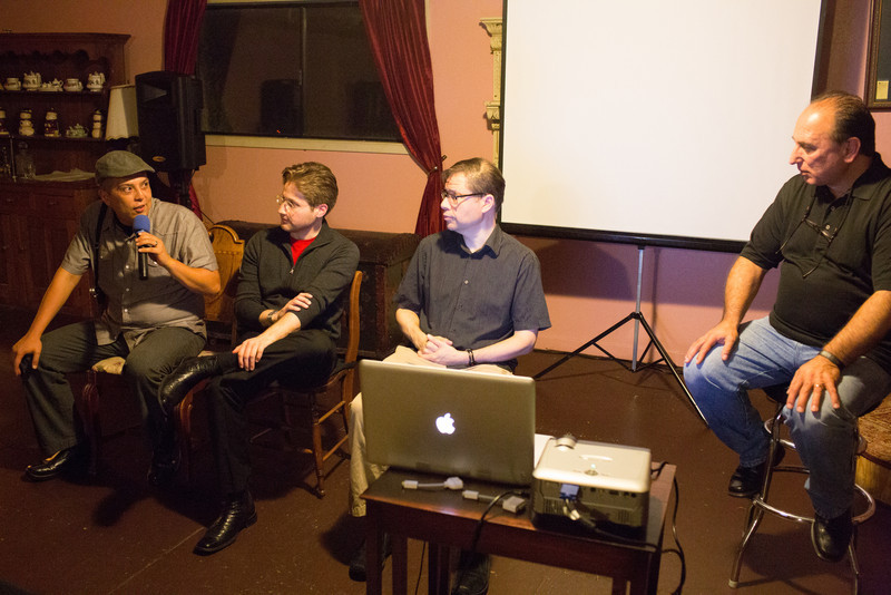
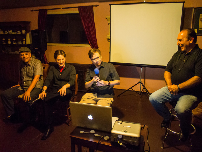
Of course, we then concluded the evening with a dynamic panel discussion led by our own dashing chairman and founder, Howard Lieberman:

In a way, the evening we had at the Angelica’s was like a history (and projection into the future) of image making–starting off with classic replica making (photography), moving on to directing and integrating (film), and finishing with an elaborate form of creating images from the ground up and inside out (graphic design and modeling). The bottom line? There is still much more to learn and discover about the possibilities behind image making and its unbounded potential to establish meaningful and generative human connections.

To join in on our next adventure together, Greased Lightning!, sign up here: 

And as always…Keep innovating!

– SVII Team